Finding your way around
CloudMonitor has three parts you’ll use constantly: the menu down the left, the filters along the top, and the report in the middle. Learn those and everything else follows.
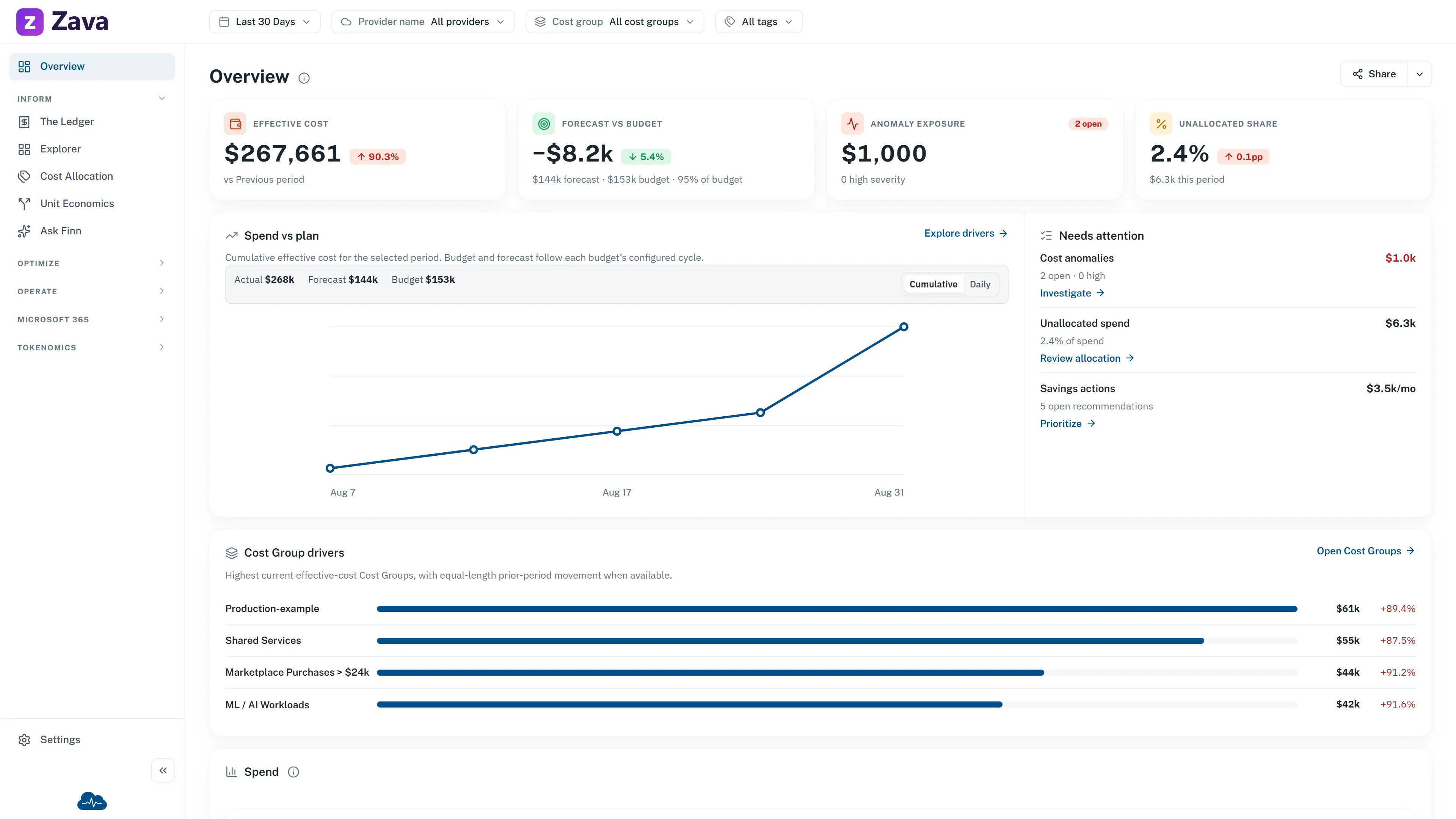
The menu
Section titled “The menu”Overview is pinned at the top — your home page. Below it, screens are grouped by what you’re trying to do rather than by what kind of data they hold:
- Inform — where did the money go? Start here when you need to explain a number.
- Optimize — where could we spend less? Savings opportunities and commitment coverage.
- Operate — what needs attention today? Anomalies, budgets, and the day-to-day surfaces.
You may also see Tokenomics, covering spend on AI tools. It’s an optional module, so not every organization has it. The same is true of one or two screens inside the other groups — if something in these docs isn’t in your menu, that’s usually why, and each page says so.
Only the group containing your current screen stays open, so the menu doesn’t grow unmanageable. Use Collapse menu at the bottom to shrink it to icons; hovering an icon then opens its group. Ask Finn remains in the Inform group for every persona. It opens the conversation when the answer service is ready and an explicit unavailable state when it is not.
For the complete list of screens and what each one answers, see every screen and what it’s for.
Settings is a separate menu
Section titled “Settings is a separate menu”Settings, at the foot of the sidebar, swaps the menu for the configuration screens — cost groups, allocation rules, budgets, virtual tags, and workspace-level settings. Most of it needs an admin role. See Roles and access.
Below it sit Send feedback, which opens an email to the CloudMonitor team, and Help & support — covered in Getting help.
If your organization has applied its own branding, a small Powered by CloudMonitor mark stays at the bottom of the menu.
The top bar
Section titled “The top bar”On the left are the global filters — the date range, provider, cost group and virtual tags. They apply to every report, not just the one you’re looking at, which is worth internalizing early. See filtering every report at once.
On the right:
- A bell for alerts, covering both cost anomalies and budget thresholds.
- Your avatar, which opens your account menu and profile and preferences.
You may also see a badge here. Demo mode means you’re looking at sample data from a fictional company, not your own spend.
A report page
Section titled “A report page”Every report has the same anatomy. The title sits at the top with a small ⓘ beside it — hover that for one sentence explaining what the page is for and where its numbers come from. It’s the fastest way to orient yourself on a screen you haven’t seen before, and it’s written by the same people who built the screen.
Below that is the report itself. Most are tables you can group, sort and drill into; see working with tables and charts.
On a phone or tablet
Section titled “On a phone or tablet”The menu collapses behind a hamburger button and slides over the page; tap outside it to dismiss. On narrower screens the filter chips fold into a single Filters button, with a badge showing how many you have set. Everything is reachable — nothing is desktop-only.