The Explorer
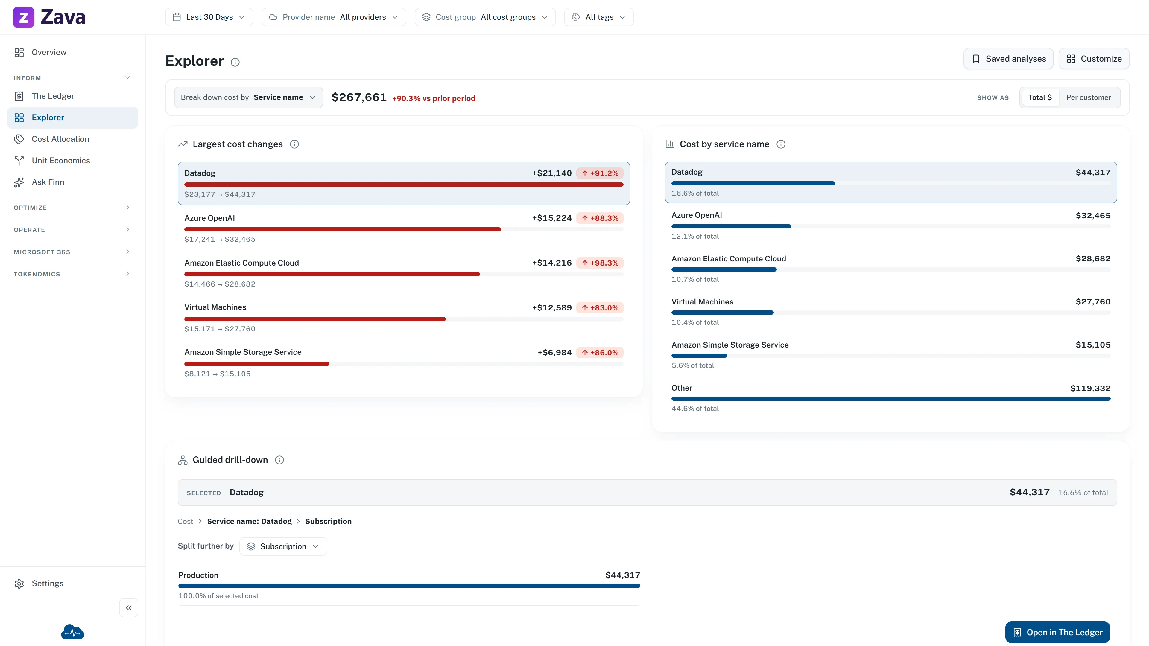
The Explorer is for the question nobody anticipated. The app’s own description of it:
Build your own analysis. Group by any dimension, switch the chart, and show cost as a rate — then save it as a View.
Where The Ledger is a table you group, the Explorer is a chart you shape. Same underlying rows, different working style.
The three controls
Section titled “The three controls”Group by any dimension. Anything the Ledger can group by, the Explorer can — plus combinations the preset breakdowns don’t offer.
Switch the chart. The same numbers as bars, lines or a breakdown. Worth flicking between: a trend that looks flat as bars often isn’t as a line.
Show cost as a rate. This is the one people miss. Instead of total spend, divide it by something that matters to your business — Per customer, per active user, per request. Total spend going up while cost per customer goes down is a good month; the total alone can’t tell you that.
Saving your work
Section titled “Saving your work”The Explorer expects you to build something worth keeping.
- Save current as… names the analysis.
- Update ”…” overwrites it after you’ve tweaked it.
- Reset to default starts over.
- Saved views lists everything you’ve kept.
Views are yours and per-report. The page address follows the view you’re on, so a link you copy opens on the same analysis.
When to use it, and when not to
Section titled “When to use it, and when not to”Use the Explorer for exploratory work, for anything expressed as a rate, and for a recurring report you’ll want again next month.
Use the Ledger when you need to reconcile a number to the bill line by line, or drill from a total to a single resource. It’s the better tool for tracing.
Filters
Section titled “Filters”Every global filter applies, plus your cost basis — so an Explorer view scoped to one cost group and one provider stays scoped when you come back to it.
If you’re building a rate, be deliberate about the Period: a per-customer figure over seven days and the same figure over a quarter are different measurements, and only one of them is stable enough to put in a report.