Your Overview
The Overview is the page CloudMonitor opens on and the one you’ll glance at most. It answers three questions at once: what are we spending, where is it going, and is anything wrong?
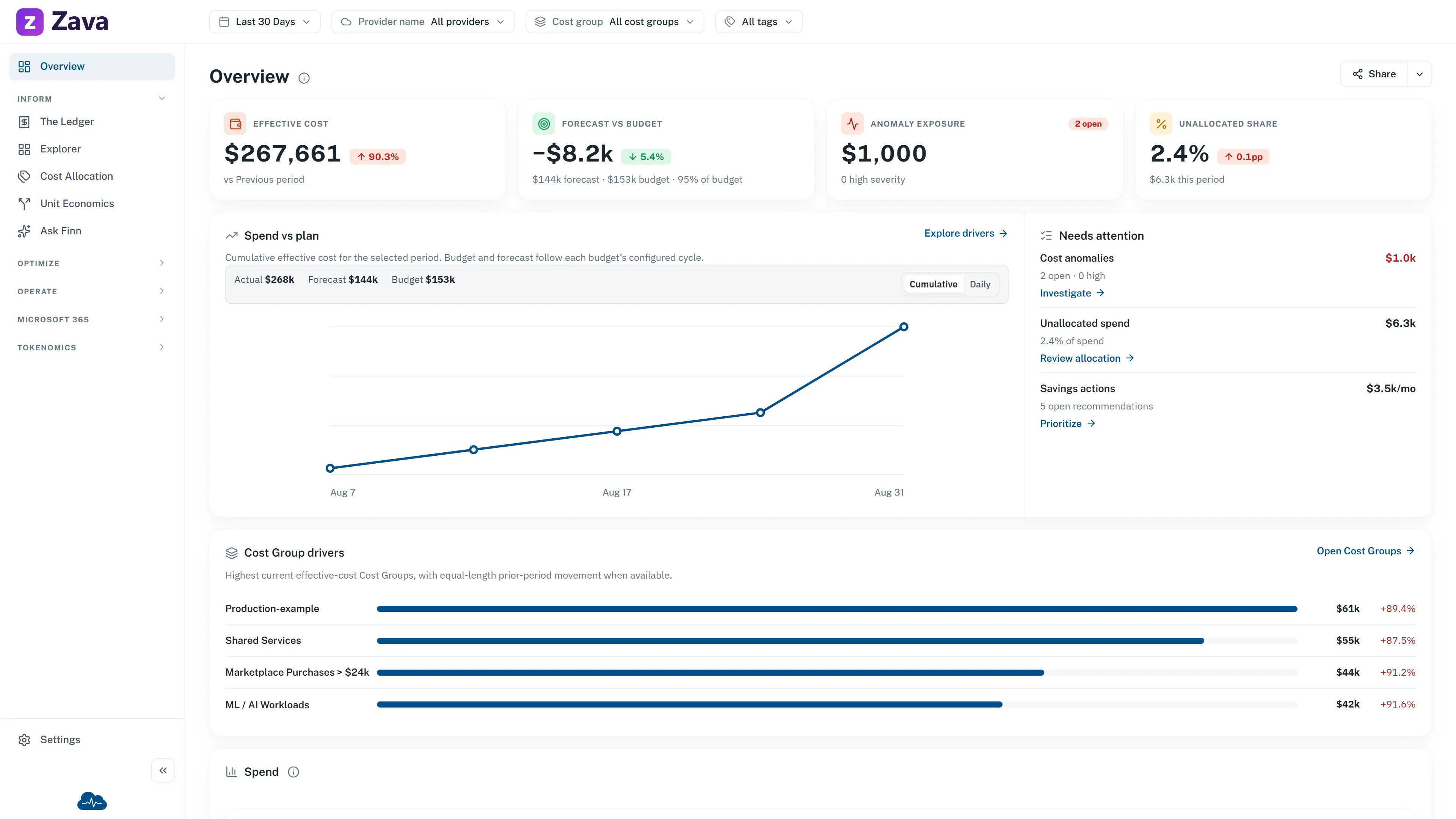
The sample data and branding in this image are from the public demo. Your figures, available actions and visible widgets depend on your data, access and configured features.
What’s on it out of the box
Section titled “What’s on it out of the box”Four numbers across the top:
- Effective cost and Billed cost side by side — the two ways of counting the same period. See effective cost vs billed cost.
- Total savings — what optimization has actually earned.
- Services — how many distinct services you’re paying for. A number that only ever goes up is worth a conversation.
Then the cards: Spend over time, Spend by provider, Cost by cost group, Budget health, Recommendations and Cost anomalies.
Each number carries its own explanation — hover it to see exactly what’s being counted. That matters more than it sounds, because “spend” has several defensible definitions and this tells you which one you’re looking at.
The one exception to the cost basis
Section titled “The one exception to the cost basis”The Spend over time chart is always effective cost, even if your personal setting is billed. The reason: a billed-cost trend spikes in whatever month you happened to buy a commitment, which makes the chart useless for spotting real change. The invoiced figure is on the tile above it, so you get both — you just don’t get a misleading line.
CloudMonitor grays out the cost-basis chip here rather than letting you toggle it, and says why when you hover.
The filters apply
Section titled “The filters apply”Period, provider, cost group and virtual tags all narrow the Overview. Scoping it to one cost group turns it into that team’s home page, which is the fastest way to answer “how are we doing?” for a part of the business.
Making it yours
Section titled “Making it yours”Edit homepage turns on arranging mode. From there:
- Add widget opens the full catalog with a switch per widget. Each one explains what it shows and which filters it honors.
- Drag to reorder. Tiles reorder among tiles, cards among cards.
- The × on a widget removes it.
- Reset to default puts it back.
Done commits, Cancel restores what you started with.
Your layout is yours alone — it doesn’t change what anyone else sees, and it follows you between devices.
Your view changes what leads
Section titled “Your view changes what leads”The View setting on your profile page changes the Overview’s title and which numbers lead:
| View | Leads with |
|---|---|
| Practitioner | Optimizable spend, idle and orphaned resources, potential savings, open anomalies |
| Leadership | Spend, forecast, realized savings, budget variance |
| Cost centre | Your groups’ spend, budget remaining, tag coverage, chargeback readiness |
It’s presentation, not permission — switching never changes what you’re allowed to see.
If it looks empty
Section titled “If it looks empty”Check the Period first: a window with no data produces an empty page that is working correctly. If a single card is empty rather than the whole page, it usually means there’s genuinely nothing there — no open anomalies is good news, and the card says so.